By Filip Aleksandrow, Interaction Design Architect
Reach him at www.linkedin.com/in/faleksandrow

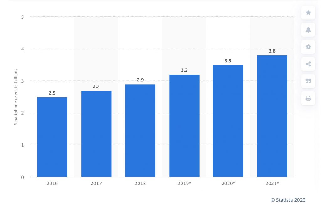
Statista: Number of smartphone users worldwide from 2016 to 2021(in billions)
Today, there are over 3.5 billion smartphone users in the world – an astounding 45% of the world’s population, according to Statista. When Apple’s iPhone was introduced in 2007, it disrupted the mobile handset market with its simple form factor, large touchscreen and user-friendly interaction design, beautifully combined with animations and audio cues. As pleased as smartphone users seem to be, the same cannot be said of owners of touchscreens in their vehicles: In 2019, 82% of vehicles sold featured a touchscreen – and yet, only half of the owners were satisfied with their infotainment systems (Consumer Reports). What is the source of this frustration in automotive, and how can a better user experience design approach with haptics be used to improve consumer sentiment?

The world adapts to flat screens on their phones
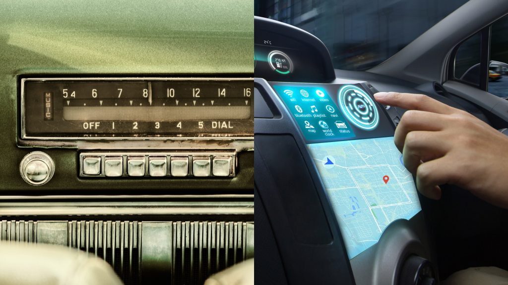
First, some background: The original iPhone iOS interface design was based on a skeuomorphic visual design approach, i.e., creating digital equivalents to real-world objects and experiences, such as pushing a button, moving a slider or turning a dial on an old-fashioned radio. This design approach contributed to the iPhone’s success because it trained users on how to interact with a flat touchscreen phone by using a 1:1 translation between the physical world and the digital world. As a result, iPhones are viewed as easy-to-use, intuitive devices with an appeal to a broad demographic, including even reticent adopters of new technology. In short, Apple used skeuomorphic design to bridge the gap between interactions familiar to consumers and new technology.
In 2015, when Apple launched a significant redesign of the iPhone, it reinforced this connection between physical and digital with the use of touch. With the iPhone 6, it launched the Taptic engine – a high quality linear resonant actuator that enabled light taps as well as a variety of other haptic effects designed to mimic the “feel” of physical objects in a digital interface.
While, skeuomorphism is less prevalent in today’s digital interfaces – since users now have an ingrained understanding of how the smartphone works – training users by referencing “known” experiences continues to be a tried and true method of driving user adoption of new technologies. Apple continues to build on its haptic user interactions in the iPhone and the Apple Watch, a device that requires the use of haptics to be functional for users.
No one is suggesting here that automotive manufacturers simply impose the smartphone UI onto cars (we’ve all seen too many negative study results of phone use in the car). Still, there are things we can learn from the mobile phone experience to help users transition to new technologies, thus improving the rate of adoption and consumer satisfaction.

The translation to automotive was not without its challenges
In the automotive world, the adoption of touchscreen in the car has been a decades-long process. As far back as 1986, Buick Riviera pioneered the concept of the infotainment system with GCC (Graphic Control Center), a 3”x4” CRT display that allowed the driver to control many settings via touch such as radio, graphic equalizer, fuel level and air-conditioning. It was a groundbreaking approach for its time. However, MotorWeek questioned the usability and safety of such a system, asking, “Is there a built-in danger of looking away from the road while you’re trying to use it?” As a result, Buick dropped GCC in its vehicles, according to Popular Mechanics, after owners found it “onerous and distracting.” (Of course, the Buick GCC didn’t have haptics.)
When Tesla introduced its electric Model S, it replaced most of the mechanical cluster buttons with its clean dashboard and a large vertical touchscreen. Viewed by consumers as a cutting-edge automotive manufacturer, Tesla embraced the use of touchscreens in its HMI at the right time. The move to touchscreens provided Tesla with the ability to customize and reprogram the car’s HMI using software, thus creating another avenue for the monetization of digital upgrades.

Adopt a user-centered design approach to in-car systems
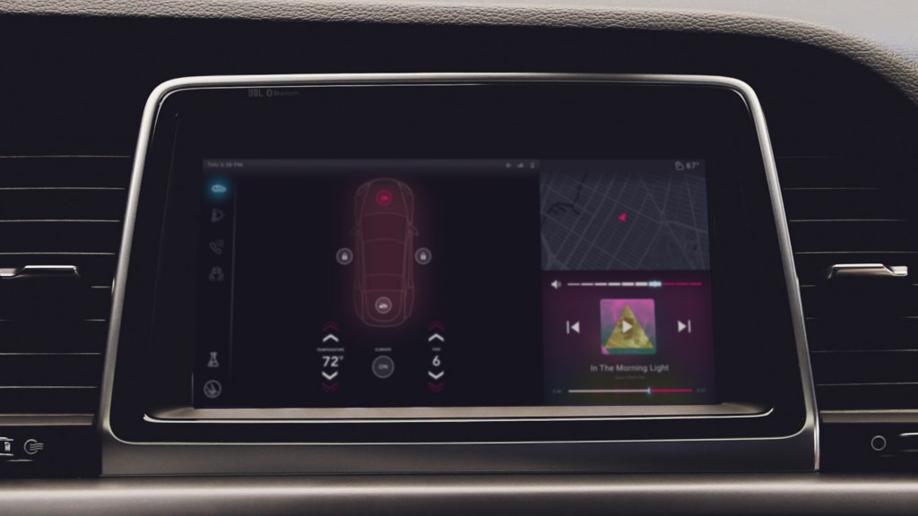
Today, most new passenger cars come equipped with a touchscreen display for their center stack console, mainly because touchscreens are a part of an expected and familiar user experience with smartphones. Users want the same multimodal, dynamic, responsive interfaces in their vehicles as they do on their mobile devices – and they notice when it’s missing. The challenge for automotive makers still stands: How do you satisfy consumers with easy-to-use, innovative technologies, all the while limiting distraction and maintaining safety?
- One way is the use of a “familiar” approach in introducing the touchscreen in the car HMI, which can ease the burden of learning new interaction models while driving the car. Adopting familiar smartphone user interaction design on a car’s touchscreen alleviates some cognitive load and may positively contribute to the users’ impression of an HMI that is easy to use and navigate.
- In addition, the use of haptics and touch can have a significant benefit as studies show it can reduce the time in which users are looking for the “right” button on the display. Because the sense of touch is a natural human sense, learning how to differentiate by touch can be relatively innate, as long as the cues are not complex.
- Haptics can be used across the car HMI to provide a tactile, skeuomorphic design approach to help the user interact the same way in which they have always done – using their sense of touch to locate and feel for the buttons, dials, and turn-knobs in the center console.
- With the greater capabilities and higher fidelity from new actuator technologies in the market, haptics can create textures that indicated the difference between the volume and tune buttons, or the temperature and fan dials.
- Currently, Apple, Google and Samsung provide a skeuomorphic-like approach that primarily consists of haptic alerts and confirmation to enhance touch gestures and interactions with components like switches, sliders and scrollable pickers, creating a more pleasant and user-friendly experience for millions of its users. Such tactile feedback could greatly benefit automotive users as well, allowing the driver to feel tactile feedback when making necessary touchscreen interactions, and in return, reducing the eyes-off-the-road gaze time. According to a 2017 study by Beruscha et al.:
- With visual and
haptic feedback, the total glance duration on the touchscreen
is reduced by 40% - With purely haptic feedback, the total glance duration is reduced by 60%
Moreover, the number of glances is also reduced by 16% with haptic and visual feedback, and 32% in the haptic feedback only situation. The study also concluded that even eyes-free touchscreen interactions are possible with haptic feedback – removing any visual distraction on the screen.
Smartphones have adopted haptics for more than a decade to improve usability and create pleasant experiences. Yet, sadly, in 2020, only around 4% of mass-produced cars with touch surfaces utilize haptics technology and only for basic button click effects (*based on Immersion’s internal data). It is crucial that operating vehicles are equipped with interactive experiences that utilize all available design methods and technologies, including haptics, with safety as the primary goal.
Follow the example of smartphones and incorporate more tactile feedback
The challenge remains in the creation of such multimodal interactions that focus on providing the user with important information and feedback in responsive and pleasant ways. There have been many great and useful adopted innovations in the automotive industry, yet we are still stuck with many of the same safety concerns drivers experienced 34 years ago; and we keep adding more distractions rather than fixing the problem. Although mobile interaction design is the primary reference for in-car touchscreens, interaction designers need to think beyond smartphones to create appropriate experiences for all use cases of drivers today. We recommend the use of all of the mechanisms available to connect with the driver to create a safer, more satisfying driver experience.

