“It was like synchronized swimming for fruit.”
Brightly colored fruit bounced against a stark black background, timed to a peppy tempo. Every beat was a chance for haptic design to bring people closer to the produce. The goal? To sell M&S Foods, a UK-based grocery store.
People don’t usually think of food as having much in common with motion, but food ads often do. Haptic designer Brian Sherry described food as a vertical that is ripe for tangible textures.
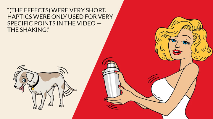
Unlike other verticals, ads for food products often don’t have a narrative. Brian explained that more often, food ads are product shots in motion. For example, an ad on which his team worked for Stoli Vodka compared an inferior version of shaking, visualized as a nervous dog, to a dressed-up bartender shaking a martini tumbler.

“(The effects) were very short. Haptics were only used for very specific points in the video — the shaking — to emphasize everything else,” Brian said.
But sometimes, food ads are less about the cooking and more about grabbing attention. One ad his team created for San Pellegrino, the fizzy water beverage, used different kinds of balls to convey a sense of energy. The balls were made of different materials, like rubber and metal.
“How does a metal ball feel on gravel?” Brian mused. “How is it different than a rubber ball on brick? What about crossing a patch of grass? Those were fun challenges.”
This ad was unusual for food and beverage products in that it featured a narrative. Starting at the top of a hill, a pair of lawn bowling balls rolled through a hilly Italian village, ending at the ocean. Chaos ensued.

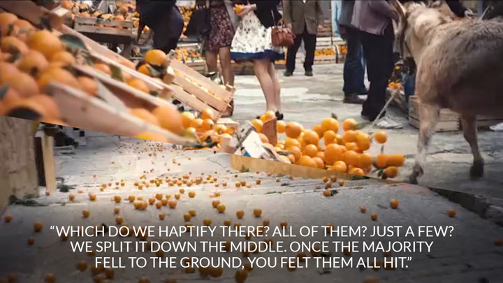
At one point, they knocked over a crate of oranges. Brian described the change in dynamics. “Suddenly we had many ‘balls’ bouncing around, and they’re a lot softer. It created an interesting question: which do we haptify there? All of them? Just a few? We split it down the middle. Once the majority fell to the ground, you felt them all hit. Luckily, the commercial cut right after that, and jumped to a different scene.”
“Another time, an orange went into a fountain. Instead of solid ground, it went through water — a very different feeling than a metal ball striking sand.”
In general, though, haptic design for food ads brings out the quality of the food.
“We’ve done at least one beer ad where we haptified pouring liquid,” he said. “Coke ads often have close-up shots of bubbles exploding from the glass, which works well,” Brian said.
When it comes to food, people know what to expect from all of their senses, so haptic design for food is closely related to the ad’s audio. “If I asked you to imagine what it sounds like to have a Coke pouring into a glass full of ice cubes, you’d understand what it sounds like. It creates a lot of bubbles, and you can feel the ice cubes move in the glass,” Brian said.
Choreographed movement is also common in ads for food. “There seems to be a lot of slow-motion flipping of meat in those videos. When the meat hits the grill or the table, we define the impact with an effect to show, ‘this is a hefty cut of meat; you’re getting your money’s worth here.’ ”

